Monday, 27 April 2009

Practioner essay


I will be comparing Tracy Kendall and Otto Dettmer. Tracy Kendall works with interiors and has worked with clothing outlets for window displays. Otto Dettmer works with editorials and creates his own artist books. I think there will be interesting comparisons between these two as there audience, client and process' vary greatly.

Otto Dettmer.


Dettmer process' include screen printing and creating imagery through a computer. He works free lance and the majority of his work appears in newspapers, particularity The Telegraph as he believes this to be a very good paper for illustration. Otto Dettmers work is primarily editorial and his works priority is for the image he creates to represent the article it is illustrating clearly and concisely. It needs to communicate the words of the article simply and efficiently as so the audience will understand the contents of the article. For his editorial work Dettmer tends to work solely on the computer, creating the basic shapes for his illustrations on his computer. The colours he uses are also quite monotone and he tends to stick within the same pallet. This makes his work very recognisable and consistent, and from looking at his illustrations he doesn't tend to sway away from what works. This however only applies to his editorial illustrations.

Otto Dettmer.

When he is creating his artist books this is a different matter. He creates artists books to sell at fairs and prefers to work in this way as he says it displays his work a lot better and he also has free rain over its contents. He experiments more with techniques in his books, including screen printing and photocopying, replacing the black ink in the photocopier with a variation of colours.

Dettmers editorial work is quick and simple illustrations, with the main aim of communicating an article. The speed in which he creates his editorial work is essential, as they may need to be completed very quickly for the clients. Dettmer says he usually spends two hours on the roughs and then two hours of the final illustration, which is vital as to get the job finished. So it is not important to create a detailed illustration with lots of experimentation and process', he just needs to create one that will satisfy his client.

Tracy Kendall's work however is aimed at a different market, so she has time to consider the materials she uses and experiment with different process'. Kendall has a BA in fine arts and also experimented a lot with screen printing. In 1996 she began experimenting with wallpaper design, in the first instance to create one for her own home.

Tracy Kendall. Stacks of books.

One piece of advice from Kendall was to not stick to a precise formula, which varies from Dettmers work with editorials. Dettmer is forced to stick with the same formula for each editorial illustration as he knows that works for him, and under the time restraints that isn't a problem. As Kendall has very little time restraints with her work, she has more freedom.

Kendall exhibits her work a lot also. In one trade show in London she was able to work outside of her allotted space, and she created a forest for people to walk around and view hers, and others work. The vary nature of how Kendall represents her work gives her less restraints and she has more control over how it is viewed, where as Dettmer does not. Kendall often creates pieces for her own interest, rather than being commissioned, and when her work is commissioned its very loosely briefed.
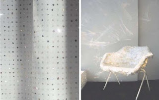
Tracy Kendall. Sequins. Robin Day Chair.

One instance of this is when she was asked to re-design a Robin Day chair, and it was all her own choice about the design. The process' in her work vary to, as she says she likes all her work to be handmade, refusing to create things in photoshop as she says it loses the quality. Tracy uses Laser Cutting a lot in her work, and enjoys playing with perspective. She likes to look at wallpaper in relation to the wall, how it interacts with it, and how it can change it. Her educational background explains as to why she works this way now. Were Dettmer comes from a graphic design background, Kendall comes from a fine art background. Graphic design involves sticking to strict briefs, as where fine art is very loosely briefed by the artist and is there for more about there own interpretations.

The two designers vary mostly because of the way there work is represented and how they are commissioned. Dettmers work is not his own chosen subject, it is a representation of somebody else's chosen subject. He doesn't have a say in the initial idea, but he has to find the best way to communicate someone else's work and idea. With his editorial work he is restricted in the process' he can use, as they need to be created quickly, so the computer would be the best tool for this. He has found ways around this by creating artist books, and this is how own personal way of being creative and creating work he enjoys. He has no brief to stick to with them, and this is his way of working for pleasure.

As Kendall exhibits work, she is then commissioned to create work based on those pieces, or given free rain. She has a lot of time to experiment and is hired based on her own personal work. She is the opposite to Dettmer, people commission Kendall on the basis of her own idea, where as Dettmer is commissioned to represent somebody else's ideas. Kendall creates work with which she would want to invest in, where as Dettmers editorial works is purely there to help communicate somebody else's. I would prefer the working style of Kendall, as I find it hard to try and represent somebody else's ideas, and to ignore all my urges to experiment with it. Both designers work very differently and for different very different clients. But they both require the same skill to create visually appealing images or pieces that will satisfy there clients and the viewer.


Saturday, 25 April 2009

Tea Acrobats


I am really happy with these images, just can't decide which one i prefer. I think at the moment its the one with less stars on it. Madame Leprince is the woman my sister will be living in Paris with next year! And the town is where she lives!

Timbuktu Boat


I arranged this image as a double page spread also, as this was how it was photographed, landscape rather than portrait. I think it would still be nice as a poster... I cant use type!!

the portrait image is wrong, i dont like it, and i messed up the image background somehow. I dont like it, yuk.

Number 54


These are the final two images for the Number 54 house. Ive really struggled finding a way to add text to the image and hope this comes across ok. Ive arranged it so they could be used in a double page spread or as two posters.

MayaGrafik


Here are some examples of Maya Grafiks work. Ive been looking at them for ideas for layouts for my posters.

Ballet Poster, Tornerose


I was just doing some quick googling n Poster layouts when I found this image. I love it, and would really like to create a similar layout for my work. I like how the text doesnt deter the attention from the main image.

Friday, 24 April 2009

Elsa Mora ... No Reply ...

Dear Elsa Mora

Hi! I'm on my final year of an illustration degree at Stockport College in England and I came across your work whilst looking on Etsy and then found you on blogspot! Ive just Begun my final major project and I will be creating paper sculptures and illustrations to a selection of stories. Your 3-D sculptures are amazing, and for my final project I was looking to do something similar, but i will be creating something like a stage scene (well thats what it is in my head) and 2-d illustrations.

I'd like to ask a few questions if you have the time? What problems do you encounter with this process and how do you tackle them? Have you ever done any work for childrens books? or editorials? Im interested in working free lance once I have completed my degree and would like to now your thoughts on this.

Any help you could give me would greatly appreciated.

Thanks alot!

Sarah Frost

Bruce Monro ... No Reply ...

Dear Bruce Munro

My name is Sarah Frost and I'm currently on my final year of an Illustration degree. I understand that you must be busy, but Im very cheeky and have just a couple of question for you! If you could find the time to answer them I would be hugley greatful.

How did you get your work 'out there' and known, how did you promote yourself? was it through setting up a studio? or did the work lead to you setting up a studio?

I have a blog which I use to show my tutors where im up to and who im looking at. Recently you were one of the people and a woman called Jenny commented on it saying she did some work for you and you would be glad to hear that you Inspired me!

Thanks,

Sarah

Container Plus Studios, dont think ill be able to make that portfolio session ...

Dear Luise

My name is Sarah Frost and I'm on my final year of an Illustration degree. I was wondering if there was any portfolio sessions coming up in May or June? I'm also very cheeky and Ive added a piece of my work to this email.

Thanks!

Sarah


Hello Sarah,

Sorry it has taken me so long to respond!
Thank you for your email and your interest in ContainerPLUS.
The next available date is thursday, the 7th of May.
Any time after 4pm -
Would that work for you?

With best wishes

Luise

font and poster text


I found this free font on www.dafont.com and created the text that will go onto my tea acrobat poster. I know i've spelt things wrong but they can be corrected!!

Circus Posters


As I want to create the Tea Acrobat IMgae into a circus poster I have been looking at how a circus poster is set out. The one thing I really like is how the type gradually decreases in size the further down the poster, like an eye chart.

Beringer Advert


This is an advert that Su Blackwell worked on with Michel Gondry's brother. I wish I still had time to create an animation.

inside book cover


this is the inside cover from the diary project, i have altered it slightly by making the image less grey and giving a warmer tone to inkeep with the rest of my work.

Boat work


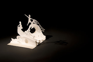
These are extra images taken for the boat work I did. I finely chose to use the boat on the white background as the spotlight showed better on it, making the image alot more dramatic.

animal work


these are the un edited photographs for the animal referal brief.

mark hadden


What I liked about Mark Haddons illustrations is the way he creates his type. I liked the hand drawn quality of it. i think thats what comes across in Rob Ryan type also, as they are both hand crafted.

Type, rob ryan


Rob Ryan is famous for his cut out illustrations and incorperating text into them. im very interested in doing something similar my self, and then scanning them in rather than photographing them.

Circus type


Ive been trying to think how to work type in with my work. for the 'Tea Cup Acrobat' image I would like to make it into a circus poster. Ive looked at various different circus types and would like to attempt to create them in cut outs, if that doesnt work, In would possibly hand draw it.

Valerie Pirson interview

I found this interview really really interesting. In it you can see how she created a scene from 'Pistache' and what techniques she uses. Its gotten me really into the idea of creating an animation, but i dont think I will have time to create it for my final piece. Its definatly something i want to look into after my degree. I really really wish I had time to create something for the show!

The Secret History


These are the images i created for the penguin book competition. Although I did not end up entering the competition I am very pleased with the images I created for it. Especially because I had to photograph the images myself and I have the most unsteadiest hands. The only thing i struggled with was the text. Im having this problem when it comes to adding text to my final images.


tea cup acrobats


these are the rough images for the the cup acrobat image. they show how i set up the image.

extra house images